| Table of Contents |
|---|
http://registerdev.marketmaker.uiuc.edu/
Interactive Mockup
Check out the interactive mockup (mm_mobile_ui_mockup.zip; unzip the file and open "index.html")
1st Priority
Business Detail Section
The business details section only lists the business type for each business. We’ve had tech in the API for some time that allows Gary to display the hierarchy of detailed profile data for each profile that a business has. In a related note, we don’t have the industry affiliations section in the business details area, either (page 7 in interactive mockup).
Check out pages 5-8 on interactive mockup.
No Farmer's market results
When I click on Farmers Market, it brings up no results
Extents of Google map needs to be adjusted
When mapping the business results, the map doesn’t zoom out to include all the results. If the results are too far, it appears it didn’t map them at all.
Adding a link to business detail page on pop-up of Google map
When clicking on the icon in mapping, it only pulls up phone and business name. I don’t know if this was agreed upon or not, but it would be nice to include a link to their profile?
Landscape mode problem
In the iPad2, the landscape mode works. As Nick said, I have problems in the Android also.
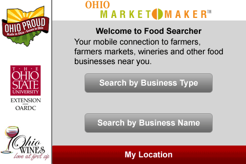
In fact, the branding banner and the sponsors take up the majority of the screen, leaving relatively little space for the user to actually browse in. In fact, on the homepage of the app, I can’t search by business name, because that option is hidden behind the location button and sponsors and I can’t scroll to see it.
I’m going to suggest that, if possible, we push the navigation buttons (Back, Home) up onto the same line as the branding banner (see the mockup). I can make the branding image smaller so everything can fit. Developer could tell me the size he thinks would work best. Also, it would be simply great if we could work out the sponsors’ sizes so that they didn’t take up much space. I’m thinking these options, in no particular order:
- Revise our size requirements and/or number requirements for sponsors. Perhaps opt for the shorter, side-by-side approach. These slots work just like the ones on the full site, so we can have them rotate with no extra work on developer’s current design.
- Maybe it’s possible to have the sponsors appear at the side of the screen when the device is put into landscape mode. See the attached screenshots for an example of what I’m proposing. Not sure if the tech could support it, but it’s worth suggesting.
Landscape mode | Portrait Mode |
|---|---|
|
|
2nd Priority
Filter Product Types
There’s no text box for limiting the products listed for a business type (Check pages 2 & 3 on interactive mockup). Filtering product types should be interactive while an user is typing in the text box. Also, when an user finished typing and hit "enter" (or click "done" button on on-screen keyboard), the web app needs to behave accordingly
Business name search
Search suggestions to work in the search by business name area.
Misc
- The initial load is very slow on the Android. Will this be better with our server?
- The loading of the Google maps caused the application to keep bringing up the URL bar, as if it kept having to make a bunch of requests to the server. It made for an odd flashing behavior that subsided once the tiles of the map were loaded. Not sure if there’s a way around that, but it might unsettle users to see the URL bar appearing for each request. Unless I’m the only one that experiences that...

