...
- When the analysis finishes, we need to change the style on the aggregation so that we can easily visualize the results. Right click your new dataset from the Scenario View, and choose Change Layer Style.
- In the style view, select the Ranged Style tab. Under the Value field, select MeanDamage or any other field you chose to aggregate and want to visualize. If we choose to show MeanDamage, then the census tracts will be colored by the average mean damage value for the buildings in that census tract. Under the color scheme box, select a color scheme that will be easy to see, such as light purple to blue.
Change number of classes to 5, which will give us 5 different shades of color and press the Apply Style button ( ) to apply these style changes. You should see a display similar to the one below.
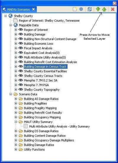
- It will be easier to see the color difference if we select the layer we created (Building Damages in Census Tract) under Mappable Data and press the green up arrow to move the layer up to the top. See figure below.